How I Draw Comics

comic sketch clip studio paint.PNG

To get started I like to make thumbnails and initial sketches for what would be the Pencilling stage in a light blue line. In the traditional on-actual-paper comics creation process, light blue pencil is typically used for under-drawings. The best thing about light blue is that it doesn't get picked up by scanners. When scanned, blue will simply disappear - it can’t get collected by a computer. 

Blue is easy for me to see and draw over - I can't imagine drawing thumbnails in light red or light yellow, so it's light blue! 

Making comics on the ipad pro clip studio paint tilted sun.PNG

After getting the basic thought of the art worked out in the light blue pencilling line, I start to make commitments in ink. Ink is all about commitment and confidence.

I never really erase the blue line - it stays in it's own layer - and when I need it I turn it on and when I don't need it I make the blue line layer invisible. It is nice to have the ability to see and unsee the original plan for the art and to see how the final inks either deviate or match the original intent. 

Before finishing the inks I start adding color, this is probably why I can only work alone. If I don’t see the relationship between inks and colors, something doesn’t feel cohesive about the work to me. At this point the art looks like a mess, but I understand it:

comic sketch half done clip studio paint.PNG

Typically I work top down on art, solving problems in ink from head to toe on the page. It would probably be fine to work more completely, throughout the entire page, but my guess is this is one of those 'to each their own!' kinds of things in art - what works for you is best! 

Sometimes coloring on the same layer as the line art feels pretty ballsy. It's a huge commitment. Occasionally I'll use selection cells to color on an additional layer instead of the same layer. This is probably the proper way to color. 

comic sketch clip studio paint tilted sun .jpg
blue line undersketch.PNG
blue line undersketch plus basic colors.jpg

I also add opacity-reduced color layers below the ink and blue line layers to get a sense of where the colors will go on the panel, and if the backgrounds make sense overall. Backgrounds and set design have always been very hard for me - I tend to think only in terms of story ideas and characters - I don't automatically consider furniture or environments, so I tend to be very impressed by good set design in comics and film. 


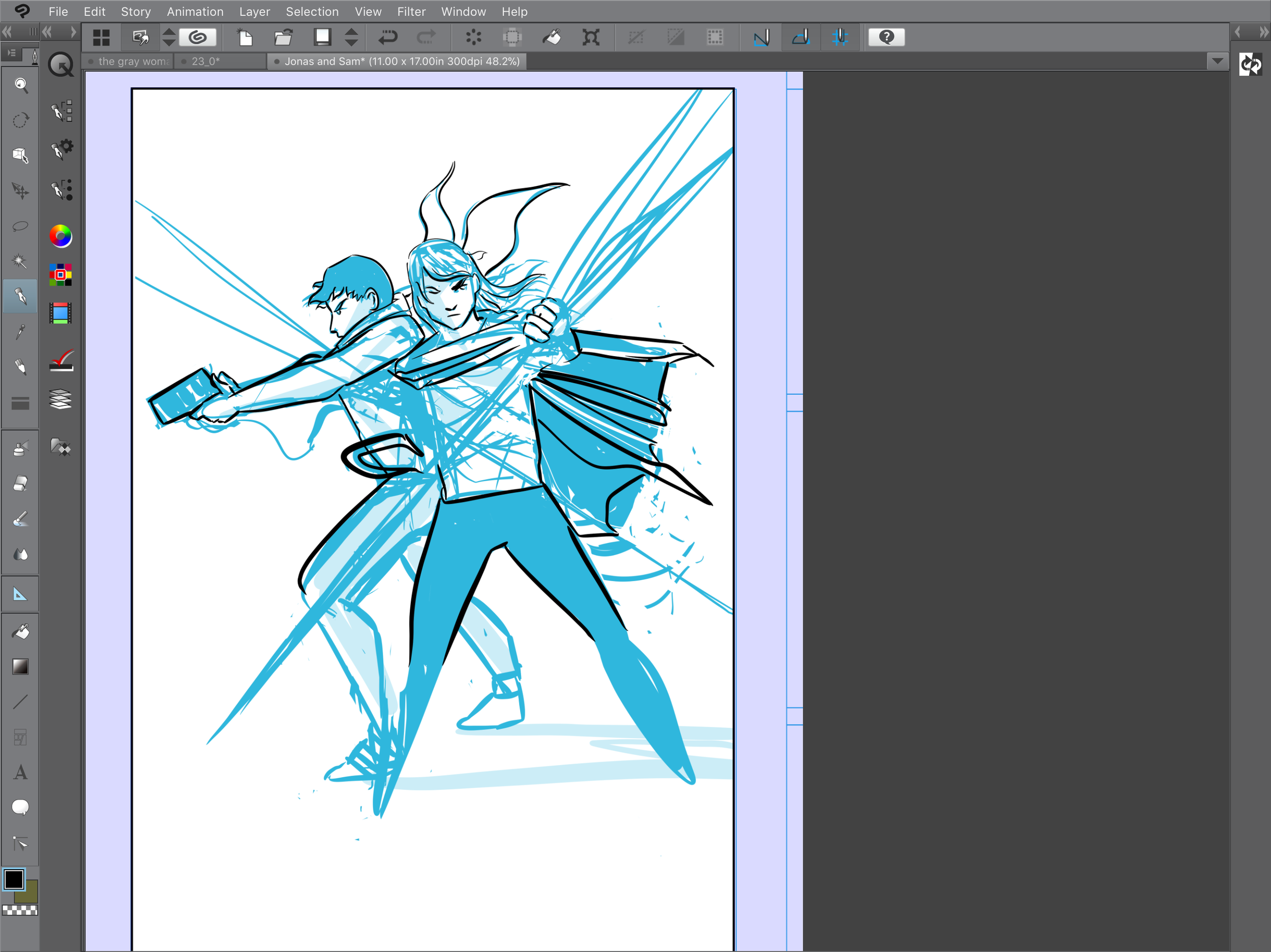
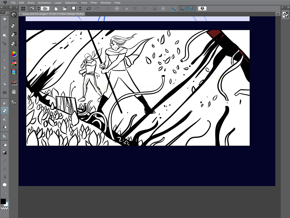
Here is the panel with the blue line underdrawing and the inks on to:

inks and blue line comic.PNG


And here are just the inks: 

digital inks only.PNG

Sometimes I like the blue/black version a lot better than the final ink version - I'm not sure why, I think it is because the blue lines retain a lot of the original feeling and motion that goes into the panel. It's a lot of chaos and indecisiveness, and it doesn't make sense, but the feelings are there, and that matters. 


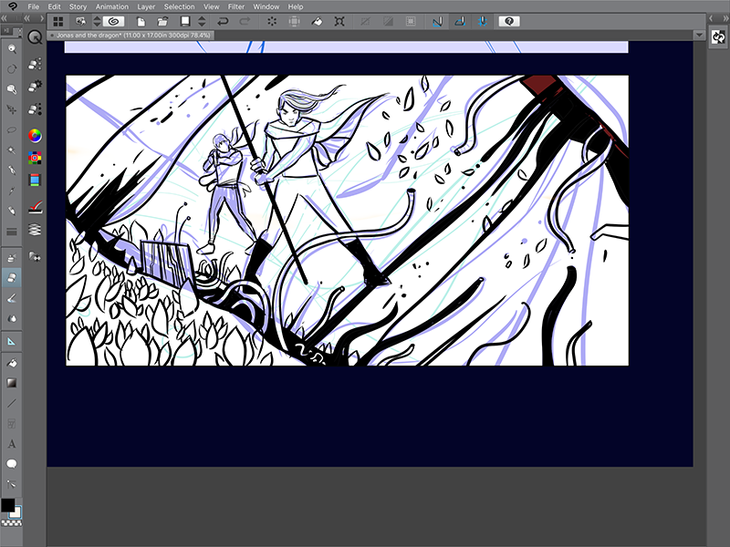
Here are another couple panels where I laid down some blue underdrawings first with inks on a higher layer:

making comics .png
tilted sun clip studio paint ipad pro.png

After a couple touchups the final layer looked pretty good!

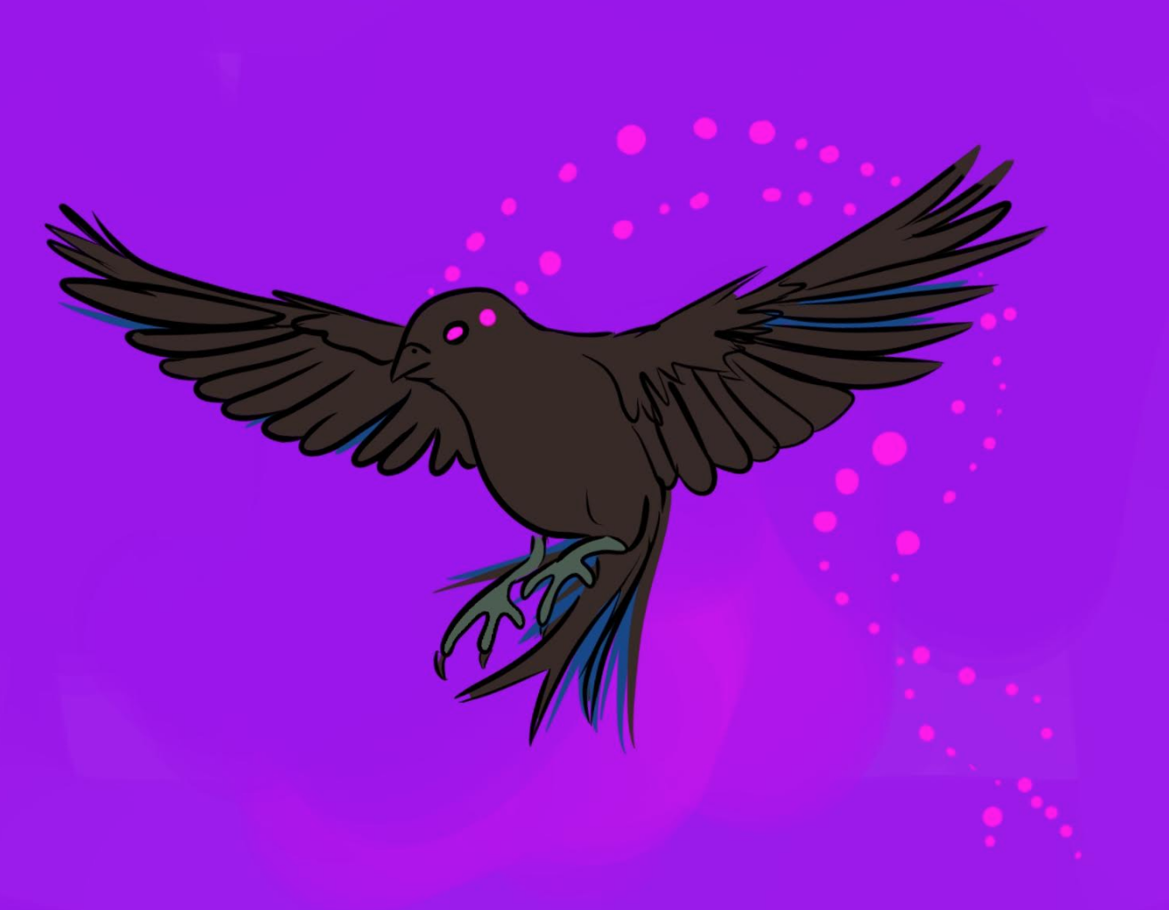
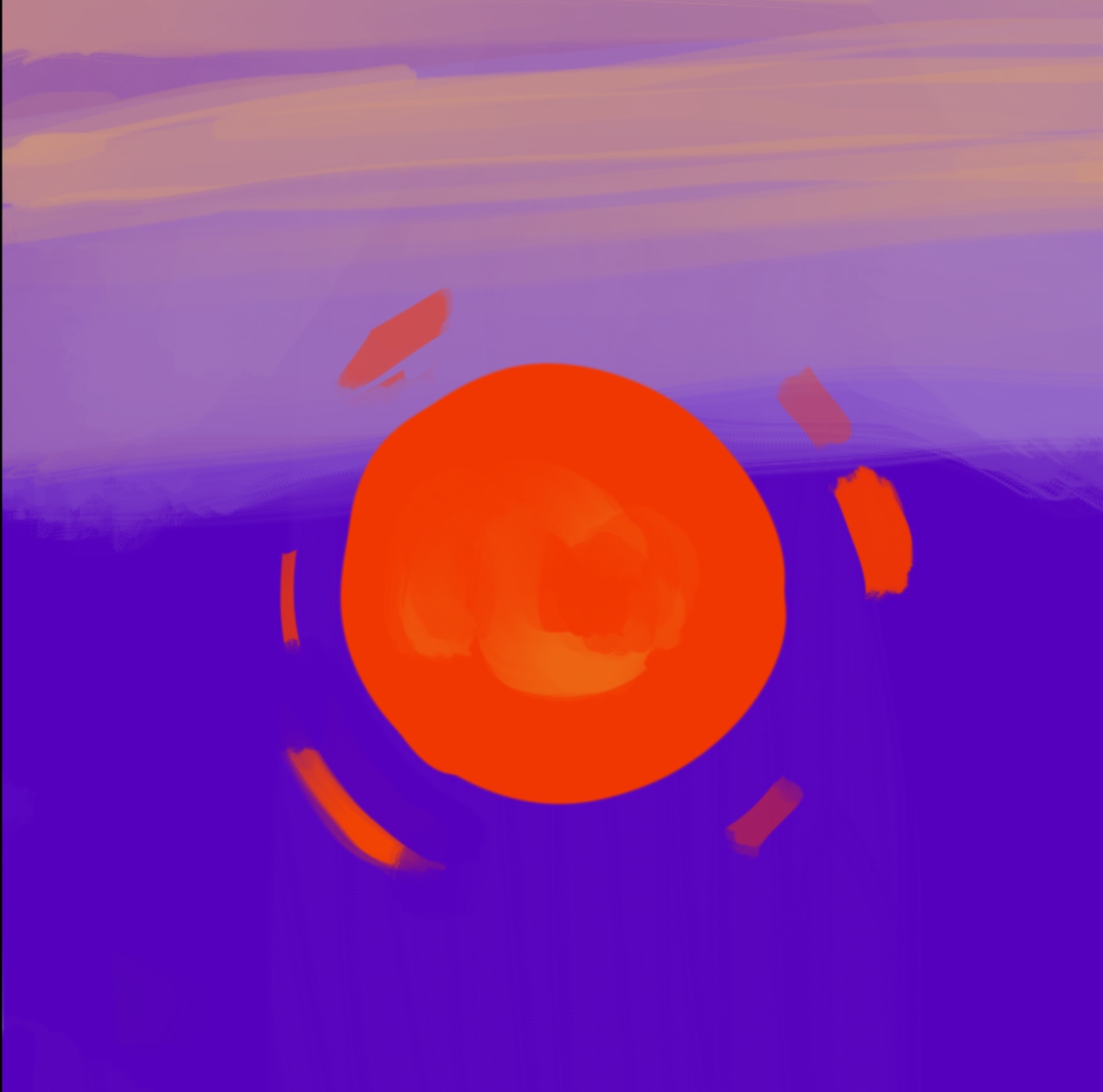
This is my whole process for making most of Tilted Sun, aside from the writing and lettering!

It’s been a wild ride so far and I’ve pretty much been rehammering the process as I go along. I think it is fine to think actively about art, and to change approaches and ideas, even struggle with art a little bit instead of adhering absolutely to a process.  

Making of: Part 1 Line Art

tilted sun line art feet scarf becky jewell artist.JPG

Hello Awesome Readers! It's time for another post of Tilted Sun Line Art! 


 All of this lineart is made in Clip Studio Paint on the iPad Pro! Before panels are painted and filled with color, I draw with Clip Studio Paint's 'Mapping Pen' . 


Eventually I'd love to get away from black line, but I love the graphic qualities of it for now. With digital art and digital painting, it's as if we live in a future where comics artists can use any kind of ink to make comics (black, yellow, blue) so we should take advantage of it! 

gray woman line art.JPG


I like to paint in background palettes to whatever I am drawing, just to make sure that the colors I have in mind ultimately look cool. 

I'm also still in the habit of creating all line art first in a separate document and then dropping the art into panels later on. I don't draw inside the panels to begin with, but since you can resize art, it's a lot like working with special effects and modeling rather than shooting a film with set boundaries. It's a lot of arranging and positioning, where I do like to follow what I think would be a good composition and framing in a film. 

tilted sun sci fi comic hackers.JPG

You can see I sorta draw the frames in the sketchbook page above - these are just so that I can figure out where the art begins and ends. 

Come back for more line art soon! 

Tilted Sun Concept Art: The Logger Bird, Orsyn, and The Tether Orb

Late concept art for the Logger Bird

Late concept art for the Logger Bird

THE LOGGER BIRD

The Logger Bird is a creepy-but-kinda-cute little guy who serves The Gray Woman in multiple forms. He keeps track of things and overall watches over The Gray Woman, almost like a drone. Eventually you get the idea that the bird isn't just a bird, it's a computer, and a pretty terrible computer at that. To draw the Logger Bird, I usually use reference photos of sparrows or small land birds - the kinds of birds that nobody would ever notice. 

tilted sun logger bird concept art keylogger.png

I played with the idea of the Logger Bird having red wings, but ultimately decided that this was too flashy for what the Logger Bird was meant to do. Eye-searing, depthless pink seemed right for his eyes. Later, I added in the trailing effect of his eyes to show movement and also a kind of blinking - it ended up looking quasi-mystical.

tilted sun logger bird directory becky jewell.png


ORSYN


As Sam's somewhat-trusted transportational friend, Orsyn gets a lot of screen time in Tilted Sun Part 1. Of all the characters in Tilted Sun, Orsyn seems to be the most diffucult for me to draw, because, horses are weird little guys! They have all kinds of knees and ankles and their noses are pretty funny. 

Orsyn Tilted Sun Concept Art Comic.png
Orsyn Tilted Sun concept art.png

At one point I drew Orsyn with a full harness and bit, and decided to scrap the harness as Orsyn is more of a freewheeling wild horse. 

THE TETHER ORB

Part One of Tilted Sun opens with an orb that is pursuing Sam and Orsyn. The orb is tiny, but I wanted to conceptualize it as something very front of mind - it's small and annoying, but to Sam, it takes up a huge amount of mental space. He's heard rumors about Tether Orbs but has never seen one before, and the orb won't stop following him. 

tilted_sun_metaphor.jpg
Tilted_Sun_Character_The_Orb.jpg

How do you give an orb a personality? Given that it's just an orb for many pages, the orb relies a lot on framing to be communicated - the orb's relationship and placement versus other characters like Orsyn and Sam were the key decision points. It will all make sense later, or not, I promise. 

This page below is an almost-completed concept for the world of Tilted Sun. Saturn is now a ringed sun, and Sam, Orsyn, the Orb, and the Gray Woman live on one of the moons of Saturn. In the foreground of this page, you can see the Tether Orb as a tiny dot. In the final version the orb will likely be much more noticeable. 

Page_23.jpg


THE STORY SO FAR....


Below is a photo of my studio in Houston in 2017 where I was working with some early layouts for part one. This was before Clip Studio Paint was released for the iPad Pro, and the comic was being made entirely in Procreate using panel templates created in Photoshop. 

Screen Shot 2017-03-02 at 8.25.16 AM.png

I liked printing out each page and hanging it up to get an overall feel for how the story would flow. After a while I translated this workflow into Photoshop, where I compiled thumbnails of each page so that I could remember which page went where. Usually, you'd do this in InDesign or in a book format in Clip Studio Paint, but since all I was doing is creating thumbnails, it worked. 

I ended up adding a lot of pages in between the pages that you see depicted, and not every panel conceptualization made it into the final cut. If I didn't like something or if it did not look cool, I scrapped it. Everything changed, however, when Clip Studio Paint was released - processes like filling an area with a flat color of paint became a one click process instead of a handpainted deal. Handpainting sounds romantic until you try it with 60 pages of line art... 

Tilted Sun early layout.png

The next Concept-to-Panel feature will cover some of the other characters in Tilted Sun, including The Gray Woman, Sam, and the guards!